With so many fabrics to choose from, it's hard to know where to start. But don't worry, we're here to help! Follow along as we answer some of our most-asked questions about fabric and provide some helpful tips to ensure you end up with an amazing finished project!
What type of fabric is best to use?
We make the majority of our models using quilting cottons, mostly because we love their great variety of patterns and colors.
We recommend that you search for fabrics with higher thread counts. We find that they last longer and tend to have a nicer feel to them.
Even if the fabric is a bit lighter in weight, using ByAnnie's Soft and Stable in your projects will really add structure and stability to any fabric you buy.
Are there alternatives to using quilting cottons?
With fun alternatives such as wool, cork, denim, leather and more, it’s easy to get caught up in the excitement of using something new. Just keep your project in mind when you buy. For example, if you’re trying to sew through several layers of fabric and Soft and Stable, or working on a small project with tight corners or one with lots of binding, using a thicker fabric may be a challenge.
Try sewing through several sample layers to see how your machine handles it before you commit to cutting out the pieces for your project. You may need to use a lighter-weight fabric for linings and bindings.
Having the right tools for the job will also make it easier. Be sure to talk to your machine dealer to get their advice on which foot to use on your sewing machine and which needles might hold up best. It may even be time to invest in a new machine.
Annie chose to use Pendleton wool for this Multitasking Messenger Bag in her Craftsy class. She used cotton quilting fabric for the lining and bindings, and she skipped quilting for a more masculine look.
How do you match your fabrics?
We think that the most exciting part of a project is picking and choosing fabrics! Of course, with so many choices available and with stashes to use up, we know that there can be a little bit of anxiety involved. Here are some things to consider before you begin.
Fabric Line
The easiest way to match fabrics is by choosing fabrics within a specific fabric line. A fabric line is usually intended to be used together as they are filled with fabrics of varying scales and intentional color harmonies. Not all quilt shops will carry an entire line of fabric and, depending how the quilt shop organizes their fabrics, the line may not be housed together. Be sure to ask the quilt shop staff for assistance.
If you're using up your stash or not planning on pulling from the same fabric line, remember that color is key. Begin by choosing a main fabric for your project. Then search for supporting fabrics that contain similar colors with varying scale.
Scale
A fabric line usually contains a variety of scale, meaning that the graphics or images inside a print are larger or smaller. For an example, look at this image (right) featuring a few fabrics from Keiko Goke’s line ‘How Do You Do?’ for FreeSpirit. Fabric ‘1’ is a small-scale print (perfect for straps and bindings), fabric ‘2’ is a medium-scale print (great for lining a bag), and fabric ‘3’ is a large-scale print (ideal for the outside of a bag).
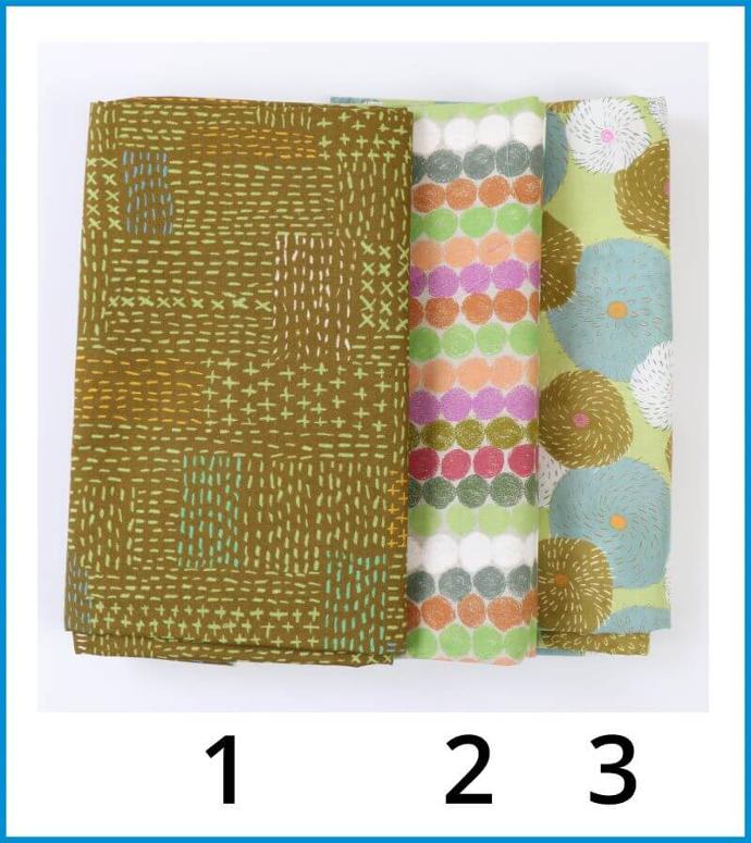
Of course, depending on the prints and style that you’re looking for, different scales can be applied in a variety of ways depending on your taste. And naturally there’s more to consider than just the scale of the fabric such as using contrasting colors and values.
Contrast (value and color)
How fabrics contrast each other can be looked at in three ways: scale, value, and color. We discussed scale in the section above, and using fabrics of contrasting scale is a great way to add visual interest to your project. If we look at the image (above) of Keiko Goke’s fabrics, there is a great contrast in scale, some contrast in value, but not as much contrast in color.
Value defines your darks and your lights whereas color defines the pigment of the fabric, such as blue or red. Colors that contrast the most are typically complementary or opposite each other on the color wheel (examples: blue vs. orange, red vs. green, purple vs. yellow).
Value and color go hand-in-hand, and if you look at the image of this 'Things That Go' fabric from DearStella you can see that there is a high contrast in value with fabric ‘1’ being the lightest, fabric ‘2’ being the darkest, and fabric ‘3’ being somewhere in the middle. Although there is a high level of contrast in these three fabrics, they still work together because they share similar colors throughout which works to create harmony. How much contrast you want in your project will determine how much visual interest you want to create and, of course, it is all up to personal taste.
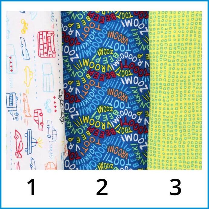
The fabrics in the below image of the 'Spice's Fusion' line from Art Gallery Fabrics use contrasting values and a lesser-contrast color scheme so its aesthetic or visual appeal could be described as more mature. On the other hand, the 'Things That Go' fabric (right) with its vibrant, high-chroma contrast might be considered more suitable for children.
Application/vibe
Sometimes the look of a fabric will help you decide what project to make with it. For example, you might use DearStella's 'Things That Go' fabric (above) to make a Changing Station 2.0 or a Catch All Caddy with children in mind. Keiko Goke’s green fabrics (shown above) would be perfect for interior decorating or a bag. We want to break it down further than this though. You have your fabrics chosen. You have varying scales and lots of contrast. Your project is picked out. But which fabric goes where?
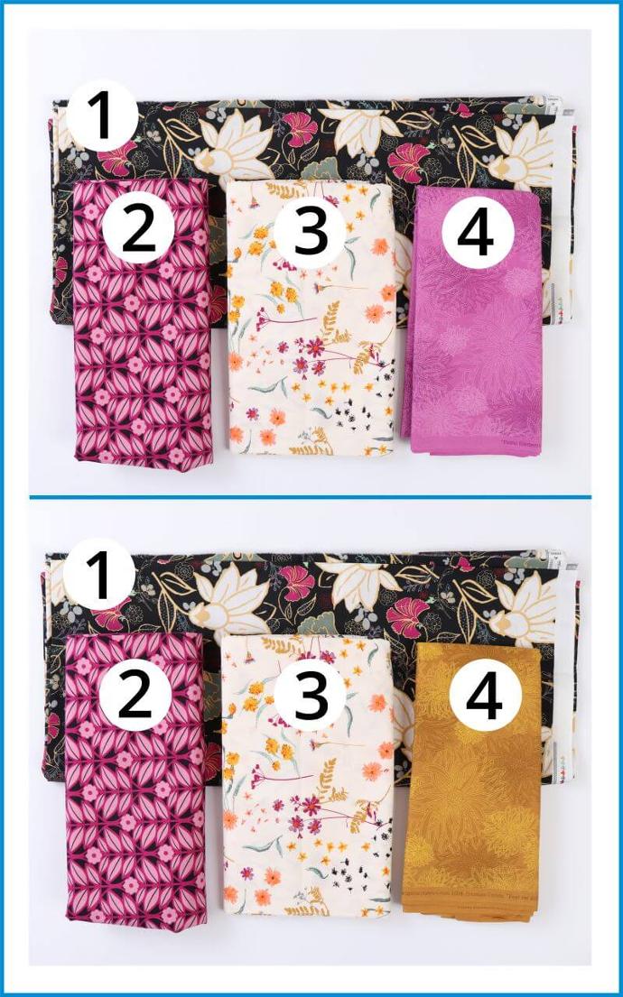
If you were to make a bag with ‘Spices Fusion’ from Art Gallery Fabrics in this image, we recommend using the larger, darker print (fabric '1') as the outside of the bag. Large, dark prints are great for the outside of a bag because daily wear-and-tear, dirt, or stains aren’t as visible.
Using fabric ‘3’ as the lining, or inside of the bag, is ideal because the lighter color will make it easy for you to find what you need when you open your bag and go searching for something inside.
Fabric ‘4’ makes a wonderful choice for binding, providing just the right amount of contrast against the dark exterior. It could easily double as a bag interior for an added pop of color.
Something to notice with fabric ‘4’ (above image) is that although it has a pattern on it, the pattern is low in contrast, allowing this fabric to read as a solid. Simply switching the purple/pink fabric ‘4’ with the gold fabric ‘4’, we can change the aesthetic of the bag. Sometimes switching out one fabric in your group can alter the ‘vibe’ of your project ever so slightly, from playful to elegant. You can see that the gold fabric ‘4’ really brings out the warm yellows in the other fabrics, while the purple/pink fabric ‘4’ reinforces the already dominant color scheme.
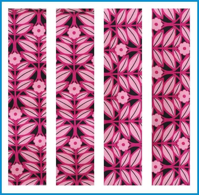
Fabric ‘2’ would be a lovely choice for straps and handles, although it could also be used as a fun binding or a main fabric on a smaller bag, such as Quick Zip Cases! If we used this fabric (image right) as the handles and straps, we have even more options because of its geometric design. You could accomplish several different looks depending on how you cut the fabric. Don’t forget to have fun exploring different ways to fussy-cut!
For a further example on how to apply a group of fabrics, look at the image (above) of the Round Trip Duffle and see how this highly contrasting fabric ‘Modern Marks’ by Christa Watson from Benartex was applied to create a playful, visually stimulating bag. Fabric '1' is great for the outside of this bag because it has an exciting design that can distract from any wear or dirt. Fabric '2' makes a great coordinating fabric that contrasts with both the main fabrics and the strapping. Fabric '3' makes great strapping because the scale of the pattern is smaller and the colors stand out well against the body of the bag.
Direction
A final thing to consider when choosing fabrics for a project is direction. Directional fabric has a distinct top and bottom. If you look at this 'Welcome To The Jungle' fabric from DearStella you can see that the giraffe design would be considered directional. You would need to consider fabric placement for your project.
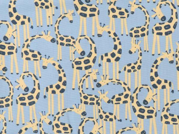
A number of Annie's patterns involve instructions for how to use directional fabric when making certain bags or when to avoid it altogether.
I have my fabric picked out, but how do I choose the hardware, mesh, and zippers?
This is one of our favorite parts. We love to audition as many options as possible. Here are some tips we've learned:
Hardware
We like using Antique Brass hardware with warm tones and Nickel with cooler tones, but ultimately the choice comes down to your personal preference. Even when using the same fabric line, you could use different colors, as we did with Gypsy by Jessica VanDenburgh for Windham Fabrics.
Mesh
Choosing mesh offers the perfect opportunity to audition colors. You’ll notice how the same swatch of fabric can look completely different just by changing the color of mesh. When picking a mesh color, be thoughtful about the entire aesthetic of the bag.
Consider whether you're trying to brighten the look or keep things subdued and whether you're trying to enhance the sharpness of a pattern or blend everything together.
Zippers
With 48 colors to choose from (and 14 colors that perfectly match our mesh and fold-over elastic), you’re sure to find something that will really enhance your bag.
You can use the zipper color to create a really high contrast to make your bag pop. Or use a zipper color that blends well with the fabric to let the pattern be the show stopper.

Our Zipper Color Card is a great resource for helping you choose the right color for your project. However, if you’re still not sure, you are welcome to send us a swatch of your fabric so we can help you find the best match.
If you send a swatch of fabric, please send a sample of the main, lining and contrasting fabric, indicating the color you would prefer to match. Be sure to send a large enough sample. For a more solid fabric, please send at least a 2 to 3 inch square. For fabrics with a pattern or multiple colors, please send a 3 to 4 inch square.
Don't Forget: Have Fun!
The most important part of selecting fabrics is to just have fun!! This is your chance to be creative and express your taste, preferences, and personality.
Let us know in the comments below how you choose your fabrics, what new projects you’re getting ready to create, or any tips and tricks you have on this topic.
MATCHING FABRIC